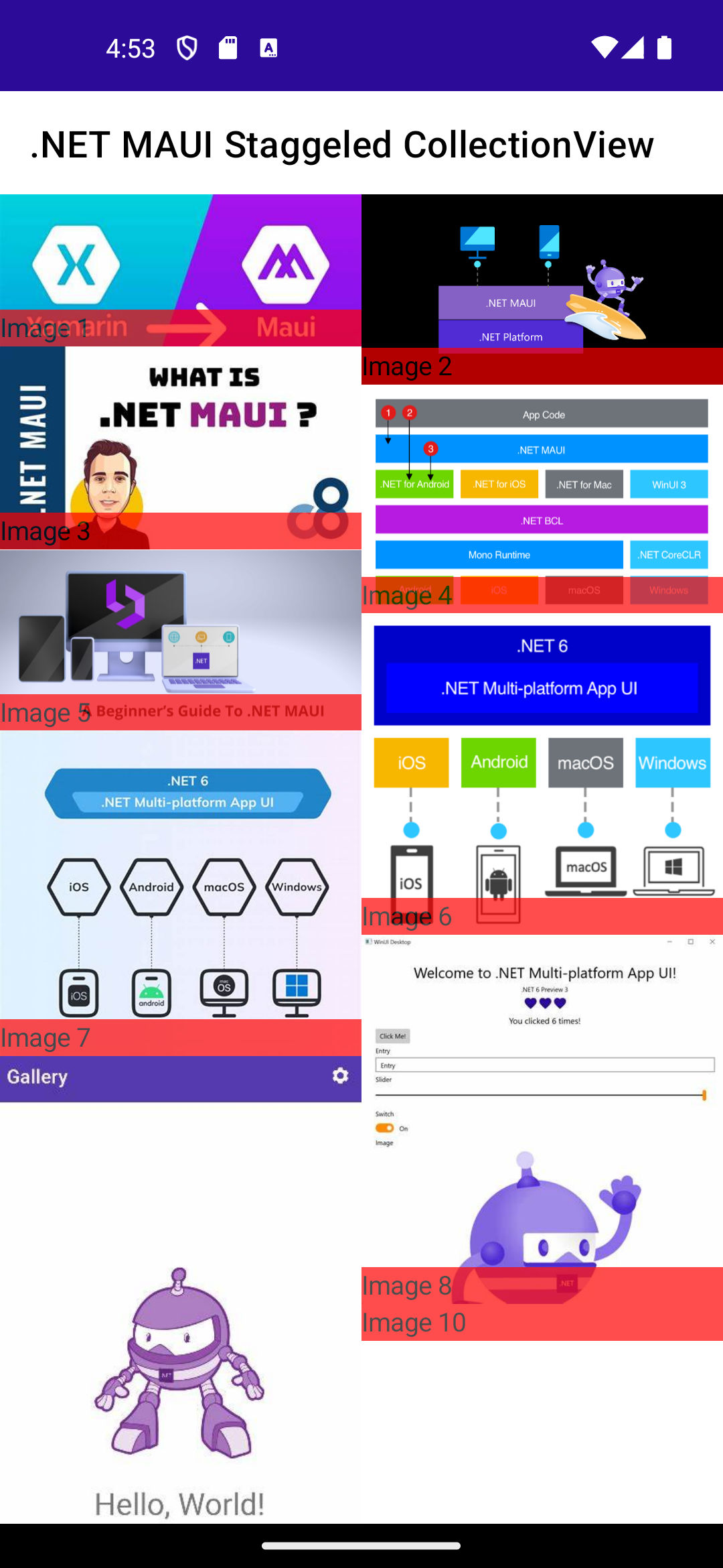
While the whole world says goodbye to Xamarin, .NET MAUI is gaining momentum and successfully taking its place.
Staggered layouts are a popular design pattern used to display collections of items with varying heights in a visually appealing and space-efficient manner. This is particularly useful for showcasing images, photos, or other content where items don't need to be perfectly aligned in rows. While .NET MAUI doesn't currently offer a dedicated StaggeredLayout for CollectionView, this article provides a practical approach to achieve a similar effect using readily available controls.
Implementing Staggered Layout for CollectionView in .NET MAUI
This guide outlines the steps involved in creating a staggered layout for CollectionView in .NET MAUI, applicable across various platforms.
Steps:
Create a new layout class
StaggeredItemsLayout
that inherits fromItemsLayout
:public class StaggeredItemsLayout(ItemsLayoutOrientation orientation) : ItemsLayout(orientation) { public static readonly BindableProperty SpanProperty = BindableProperty.Create(nameof(Span), typeof(int), typeof(StaggeredItemsLayout), default(int)); public StaggeredItemsLayout() : this(ItemsLayoutOrientation.Vertical) { } public int Span { get => (int)GetValue(SpanProperty); set => SetValue(SpanProperty, value); } }
Create a custom handler
StaggeredStructuredItemsViewHandler
that inherits fromStructuredItemsViewHandler
:public class StaggeredStructuredItemsViewHandler : StructuredItemsViewHandler<CollectionView> { public StaggeredStructuredItemsViewHandler() : base(StaggeredStructuredItemsViewMapper) { } public StaggeredStructuredItemsViewHandler(PropertyMapper? mapper = null) : base(mapper ?? StaggeredStructuredItemsViewMapper) { } public static PropertyMapper<CollectionView, StructuredItemsViewHandler<CollectionView>> StaggeredStructuredItemsViewMapper = new(StructuredItemsViewMapper) { [StructuredItemsView.ItemsLayoutProperty.PropertyName] = MapItemsLayout }; #if ANDROID private static void MapItemsLayout(StructuredItemsViewHandler<CollectionView> handler, CollectionView view) { var platformView = handler.PlatformView as MauiRecyclerView<CollectionView, ItemsViewAdapter<CollectionView, IItemsViewSource>, IItemsViewSource>; switch (view.ItemsLayout) { case StaggeredItemsLayout staggeredItemsLayout: platformView?.UpdateAdapter(); platformView?.SetLayoutManager( new AndroidX.RecyclerView.Widget.StaggeredGridLayoutManager( staggeredItemsLayout.Span, staggeredItemsLayout.Orientation == ItemsLayoutOrientation.Horizontal ? AndroidX.RecyclerView.Widget.StaggeredGridLayoutManager.Horizontal : AndroidX.RecyclerView.Widget.StaggeredGridLayoutManager.Vertical)); break; default: platformView?.UpdateLayoutManager(); break; } } #endif #if IOS || MACCATALYST protected override ItemsViewLayout SelectLayout() { var itemsLayout = ItemsView.ItemsLayout; if (itemsLayout is StaggeredItemsLayout staggeredItemsLayout) { return new StaggeredItemsViewLayout(staggeredItemsLayout, ItemSizingStrategy.MeasureAllItems); } return base.SelectLayout(); } #endif #if WINDOWS protected override Microsoft.UI.Xaml.Controls.ListViewBase SelectListViewBase() { return VirtualView.ItemsLayout switch { StaggeredItemsLayout staggeredItemsLayout => new Microsoft.UI.Xaml.Controls.GridView() { ItemsPanel = (Microsoft.UI.Xaml.Controls.ItemsPanelTemplate)Microsoft.UI.Xaml.Application.Current.Resources["StaggeredItemsPanel"] }, _ => base.SelectListViewBase() }; } #endif }
So for Android, we use
StaggeredGridLayoutManager
, for iOS and macOS, we use a customStaggeredItemsViewLayout
, and for Windows, we use aGridView
with aStaggeredPanel
inItemsPanel
fromCommunityToolkit.WinUI.UI.Controls.Primitives
.Register a custom handler in
MauiProgram.cs
to handle the CollectionView:builder .UseMauiApp<App>() .ConfigureMauiHandlers(c => { c.AddHandler<CollectionView, StaggeredStructuredItemsViewHandler>(); });
Apply the layout for the CollectionView:
<CollectionView x:Name="MyCollectionView"> <CollectionView.ItemsLayout> <mauiStaggeredCollectionView:StaggeredItemsLayout Span="2" /> </CollectionView.ItemsLayout> <CollectionView.ItemTemplate> <DataTemplate> <Grid x:DataType="mauiStaggeredCollectionView:Card"> <Image Source="{Binding Image}"/> <Label Text="{Binding Label}" HeightRequest="20" VerticalOptions="End" BackgroundColor="Red" Opacity="0.7"/> </Grid> </DataTemplate> </CollectionView.ItemTemplate> </CollectionView>
Android iOS MacCatalyst Windows
Conclusion
While a dedicated StaggeredLayout for CollectionView is not yet available in .NET MAUI, this approach provides a solid foundation for creating visually appealing staggered layouts using readily available controls. By following these steps and considering platform-specific adjustments if necessary, you can effectively implement a staggered layout for your CollectionView in .NET MAUI applications.
The full code can be found on GitHub.
Feel free to explore the code and experiment with different layouts to suit your needs.