Mastering Composite Controls in .NET MAUI. Building a TabView from Scratch

Mastering Composite Controls in .NET MAUI. Building a TabView from Scratch

30 November 2023

.NET MAUI/Xamarin

Buy Me A Coffee

Hello!

.NET 8 has been released! This new great release brings a ton of improvements and features to the .NET MAUI!

Today we'll talk about A Thousand and One Nights ways of creating complex controls using simple out-of-the-box .NET MAUI controls.

Introduction

Composite controls are an essential aspect of user interface development, allowing developers to create complex and reusable components by combining simpler existing ones. In .NET MAUI, developers can tailor UI components to their specific needs by harnessing the flexibility of the framework's control set. Although .NET MAUI doesn't provide a pre-built TabView control, it's entirely possible to construct one using various approaches. In this article, we will take a look at TabView control creation using .NET MAUI control composition.

To represent the tab, let's create a small class:

public partial class Tab : View
{
	[AutoBindable]
	private ImageSource? icon;

	[AutoBindable]
	private string title = string.Empty;

	[AutoBindable(DefaultValue = "new ContentView()")]
	private IView content = new ContentView();
}

Each tab has an icon, title, and content.

Let's create a collection of tabs in our ViewModel:

public partial class MainViewModel : ObservableObject
{
	[ObservableProperty]
	private Tab selectedTab;

	public ObservableCollection<Tab> Tabs { get; set; } = new();

	public MainViewModel()
	{
		Tabs.Add(new Tab()
		{
			Title = "Tab1",
			Content = new Label() { Text = "Cat" },
			Icon = "cat.png"
		});
		Tabs.Add(new Tab()
		{
			Title = "Tab2",
			Content = new Label() { Text = "Dog" },
			Icon = "dog.png"
		});
    }
}

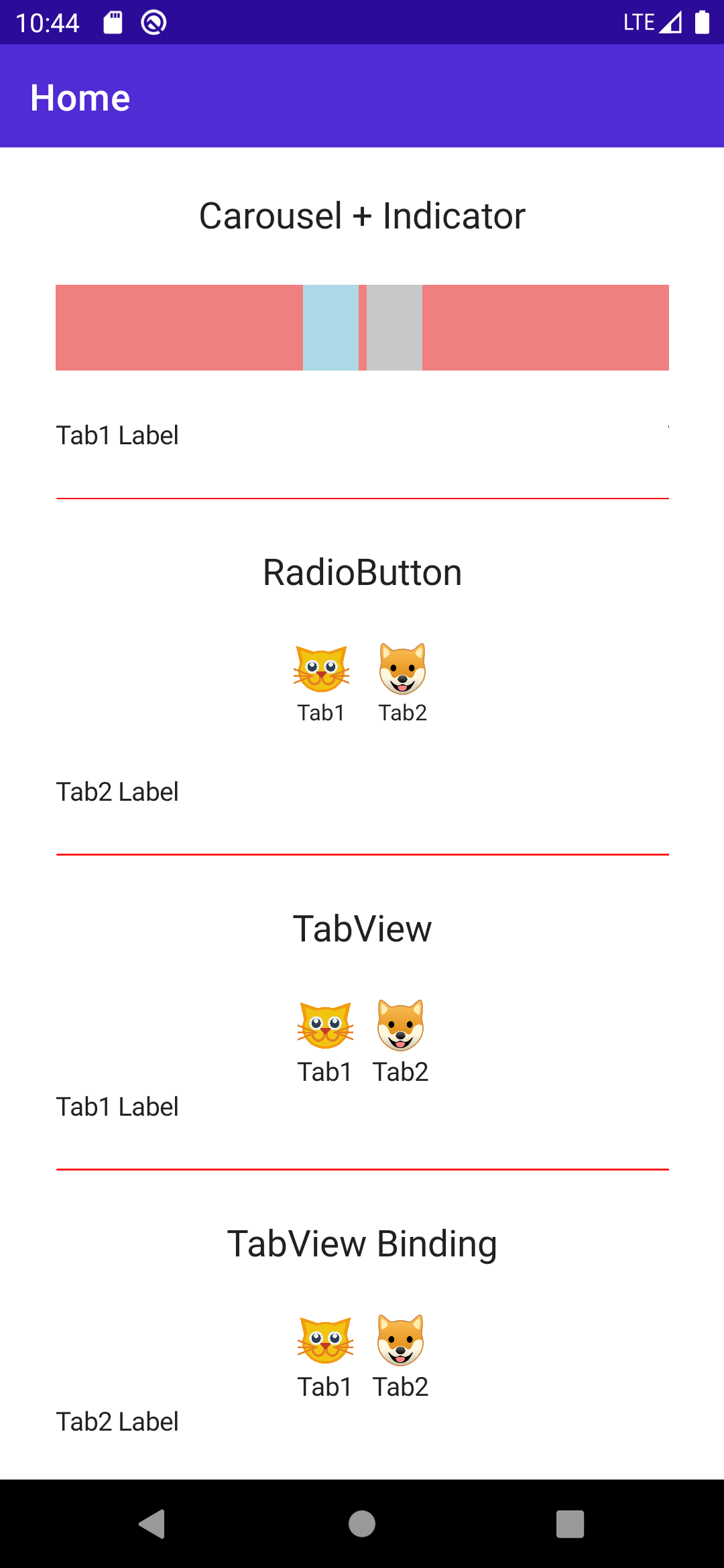
Approach 1: IndicatorView and CarouselView

The combination of an IndicatorView and CarouselView is the closest to a native tabbed interface in .NET MAUI. The CarouselView enables users to swipe through content, while the IndicatorView visually represents the current page position.

To create the TabView, you place the IndicatorView above or below the CarouselView. Bind the ItemsSource of CarouselView to the Tabs collection and IndicatorView to the IndicatorView. This method provides a sleek, swipeable tab interface, ideal for image galleries or onboarding screens. Thanks to IndicatorView reference, Position automatically synchronizes between two controls.

The default IndicatorView template is just a circle, but we can easily change it using IndicatorTemplate.

<ContentPage.Resources>
    <DataTemplate x:Key="IndicatorDataTemplate">
        <VerticalStackLayout>
            <Image Source="{Binding Icon}"
                    WidthRequest="30"
                    HeightRequest="30"
                    HorizontalOptions="Center"/>
            <Label Text="{Binding Title}"  FontSize="12"
                    HorizontalOptions="Center"/>
        </VerticalStackLayout>
    </DataTemplate>
</ContentPage.Resources>

<IndicatorView x:Name="Indicator"
        HorizontalOptions="Center"
        SelectedIndicatorColor="LightBlue"
        IndicatorTemplate="{StaticResource IndicatorDataTemplate}"/>

<CarouselView ItemsSource="{Binding Tabs}"
                IndicatorView="{x:Reference Indicator}"
                HorizontalScrollBarVisibility="Never"
                Loop="False"
                Position="0">
    <CarouselView.ItemTemplate>
        <DataTemplate x:DataType="mauiTabView:Tab">
            <ContentView Content="{Binding Content}"/>
        </DataTemplate>
    </CarouselView.ItemTemplate>
</CarouselView>

Approach 2: ContentView and RadioButton

Another way to create a TabView is by using a ContentView to host the tab content and a series of RadioButton controls to serve as the tab headers.

This approach also uses Binding to the RadioButtonGroup.SelectedValue. When a RadioButton is checked, the content of the ContentView switches to the corresponding view.

With this approach, we cannot swipe between tabs but still have a great user experience on all platforms.

<ContentPage.Resources>
    <ControlTemplate x:Key="TabControlTemplate">
        <VerticalStackLayout BindingContext="{Binding Source={RelativeSource TemplatedParent}}">
            <Image Source="{Binding Value.Icon}"
                    WidthRequest="30"
                    HeightRequest="30"
                    HorizontalOptions="Center"/>
            <Label Text="{Binding Value.Title}"  FontSize="12"
                    HorizontalOptions="Center"/>
        </VerticalStackLayout>
    </ControlTemplate>
</ContentPage.Resources>


<ScrollView Orientation="Horizontal"
            HorizontalOptions="Center">
    <HorizontalStackLayout RadioButtonGroup.GroupName="tabs"
                            BindableLayout.ItemsSource="{Binding Tabs2}"
                            RadioButtonGroup.SelectedValue="{Binding SelectedTab}">
        <BindableLayout.ItemTemplate>
            <DataTemplate x:DataType="Tab">
                <RadioButton Value="{Binding }"
                                ControlTemplate="{StaticResource TabControlTemplate}">
                </RadioButton>
            </DataTemplate>
        </BindableLayout.ItemTemplate>
    </HorizontalStackLayout>
</ScrollView>

<ContentView Content="{Binding SelectedTab.Content}"/>

Approach 3: VerticalStackLayout and HorizontalStackLayout

For a fully customizable yet potentially more labor-intensive implementation, consider using a VerticalStackLayout for the container and HorizontalStackLayout for tab headers.

This method is more complex because it requires calculating and animating the scroll position when tabs are clicked, but it gives you maximum control over the UI and behavior of your tabs.

public partial class TabView : VerticalStackLayout
{
	[AutoBindable(DefaultValue = "new System.Collections.ObjectModel.ObservableCollection<Tab>()", OnChanged = "OnTabsChanged")]
	private ObservableCollection<Tab> tabs = new();

	[AutoBindable(DefaultValue = "-1", OnChanged = "OnActiveTabIndexChanged")]
	private int activeTabIndex;

	void OnTabsChanged()
	{
		Children.Clear();
		Children.Add(BuildTabs());
		OnActiveTabIndexChanged();
		ActiveTabIndex = Tabs.Count > 0 ? 0 : -1;
	}

	public TabView()
	{
		Loaded += TabView_Loaded;
	}

	private void TabView_Loaded(object? sender, EventArgs e)
	{
		OnTabsChanged();
	}

	void OnActiveTabIndexChanged()
	{
		var activeTab = GetActiveTab();
		if (activeTab is null)
		{
			return;
		}

		if (Children.Count == 1)
		{
			Children.Add(activeTab);
		}
		else
		{
			Children[1] = activeTab;
		}
	}

	IView BuildTabs()
	{
		var view = new HorizontalStackLayout()
		{
			HorizontalOptions = LayoutOptions.Center,
			Spacing = 10
		};
		for (var index = 0; index < Tabs.Count; index++)
		{
			var tab = Tabs[index];
			var index1 = index;
			var tabHeader = new VerticalStackLayout()
			{
				GestureRecognizers =
				{
					new TapGestureRecognizer()
					{
						Command = new Command((() => ActiveTabIndex = index1))
					}
				}
			};
			tabHeader.Children.Add(new Image() { Source = tab.Icon, HorizontalOptions = LayoutOptions.Center, WidthRequest = 30, HeightRequest = 30 });
			tabHeader.Children.Add(new Label() { Text = tab.Title, HorizontalOptions = LayoutOptions.Center });
			view.Children.Add(tabHeader);
		}

		return view;
	}

	IView? GetActiveTab()
	{
		if (Tabs.Count < ActiveTabIndex || ActiveTabIndex < 0)
		{
			return null;
		}

		var activeTab = Tabs[ActiveTabIndex];
		return activeTab.Content;
	}
}

This is how you can build TabView in XAML:

<mauiTabView:TabView>
    <mauiTabView:TabView.Tabs>
        <mauiTabView:Tab Title="Tab1" Icon="cat.png">
            <mauiTabView:Tab.Content>
                <Label Text="Cat"/>
            </mauiTabView:Tab.Content>
        </mauiTabView:Tab>
        <mauiTabView:Tab Title="Tab2" Icon="dog.png">
            <mauiTabView:Tab.Content>
                <Label Text="Dog"/>
            </mauiTabView:Tab.Content>
        </mauiTabView:Tab>
    </mauiTabView:TabView.Tabs>
</mauiTabView:TabView>

Conclusion

While .NET MAUI doesn't include a TabView control out of the box, the framework's modular architecture empowers developers to construct it using existing controls like IndicatorView and CarouselView, ContentView and RadioButton, or even just StackLayouts. Each approach offers different trade-offs in terms of complexity, control, and appearance, allowing developers to pick the one that best fits their project's requirements. By mastering these techniques, developers can deliver compelling and customized user experiences on any platform supported by .NET MAUI.

This is how TabView looks on Android:

.NET MAUI TabView

The full code can be found on GitHub.

Happy coding!

Buy Me A Coffee

Related:

How to show SnackBar and Toast in .NET MAUI

Demonstrate how to configure SnackBar and Toast using .NET MAUI Community Toolkit.

Adding Application Insights to .NET MAUI Application

This article provides an in-depth exploration into how you can integrate Microsoft's Application Insights into your .NET MAUI application. A comparative study between Microsoft AppCenter and Application Insights is also highlighted, demystifying the inherent advantage of Application Insights in application management and analytics.

An unhandled error has occurred. Reload

🗙