
Hello!
It's November and that means it's time for releases! Microsoft releases .NET 7 - the fastest .NET ever! .NET MAUI Team presents a new .NET MAUI release with Maps, many desktop features, and bug fixes. And of course, the .NET MAUI Community team has 3 releases!!! 1.4.0 adds DockLayout and Expander, 2.0.0 adds Tizen support, 3.0.0 adds .NET 7 support.
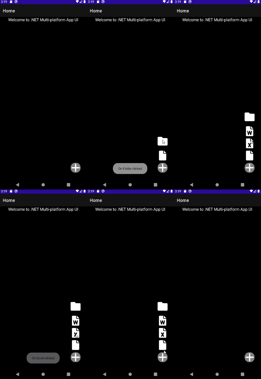
In this article, we'll create a dynamic floating action button using a new Expander control.
As usual, you need to install the .NET MAUI CommunityToolkit NuGet package.
The Expander control provides an expandable container to host any content. The control has two main properties to store your content: Header and Content.
Let's create a floating action button.
The floating action button is usually displayed in the bottom right corner, so we put it in Grid and set VerticalOptions and HorizontalOptions to End. Expander can be expanded in 2 directions: Up and Down. Because our floating action button is at the bottom of the page, let's set the expander direction as Up. We should receive such XAML:
<Grid>

	<views:Expander HorizontalOptions="End"
				     VerticalOptions="End"
				     Margin="30"
				     Direction="Up">
		<views:Expander.Header>
			...
		</views:Expander.Header>
		<views:Expander.Content>
			...
		</views:Expander.Content>
	</views:Expander>
</Grid>
Now let's set add the button content. For that we set the expander Header property with the next XAML:
<ImageButton
BackgroundColor="Gray"
CornerRadius="20"
HorizontalOptions="End"
VerticalOptions="End">
<ImageButton.Source>
<FontImageSource
FontFamily="FASolid"
Glyph="+" />
</ImageButton.Source>
</ImageButton>Each time you click on it, Expander content will toggle.
Now let's add the dynamic content. Add the next code to the expander Content:
<VerticalStackLayout Spacing="20">
<ImageButton
Clicked="OnFolderClicked"
HorizontalOptions="End">
<ImageButton.Source>
<FontImageSource
FontFamily="FASolid"
Glyph="" />
</ImageButton.Source>
</ImageButton>
<ImageButton
Clicked="OnFileClicked"
HorizontalOptions="End">
<ImageButton.Source>
<FontImageSource
FontFamily="FASolid"
Glyph="" />
</ImageButton.Source>
</ImageButton>
</VerticalStackLayout>That's it. If you run the app, you should see the floating action button. By clicking on it, our folder and file buttons should appear above the action button.
You can even go further and add Expander in another Expander. The full XAML can look like this:
<Grid>
<views:Expander HorizontalOptions="End"
VerticalOptions="End"
Margin="30"
Direction="Up">
<views:Expander.Header>
<ImageButton
BackgroundColor="Gray"
CornerRadius="20"
HorizontalOptions="End"
VerticalOptions="End">
<ImageButton.Source>
<FontImageSource
FontFamily="FASolid"
Glyph="+" />
</ImageButton.Source>
</ImageButton>
</views:Expander.Header>
<views:Expander.Content>
<VerticalStackLayout Spacing="20">
<ImageButton
Clicked="OnFolderClicked"
HorizontalOptions="End">
<ImageButton.Source>
<FontImageSource
FontFamily="FASolid"
Glyph="" />
</ImageButton.Source>
</ImageButton>
<views:Expander Direction="Up"
Margin="0,0,0,10">
<views:Expander.Header>
<ImageButton
HorizontalOptions="End"
VerticalOptions="Center">
<ImageButton.Source>
<FontImageSource
FontFamily="FASolid"
Glyph="" />
</ImageButton.Source>
</ImageButton>
</views:Expander.Header>
<views:Expander.Content>
<VerticalStackLayout Margin="0,0,0,10" Spacing="10">
<ImageButton
Clicked="OnWordClicked"
HorizontalOptions="End">
<ImageButton.Source>
<FontImageSource
FontFamily="FASolid"
Glyph="" />
</ImageButton.Source>
</ImageButton>
<ImageButton
Clicked="OnExcelClicked"
HorizontalOptions="End">
<ImageButton.Source>
<FontImageSource
FontFamily="FASolid"
Glyph="" />
</ImageButton.Source>
</ImageButton>
</VerticalStackLayout>
</views:Expander.Content>
</views:Expander>
</VerticalStackLayout>
</views:Expander.Content>
</views:Expander>
</Grid>More details on how to set up and use Expander can be found on the Microsoft Docs.
The final code can be found on GitHub.
Happy coding!