Hi there!
Today I am excited to announce a new category - Xamarin! Xamarin is an awesome open-source mobile app platform for .NET. While it is in a stage of evolution to .NET MAUI, I want to share a must-have package you will definitely love. And this is Xamarin Community Toolkit (XCT). This library contains a lot of features, which are used in almost all projects: behaviors, converters, effects, MVVM utilities, and awesome new controls including the CameraView, AvatarView, TabView, and much more.
In this article, I will describe how to use a new Snackbar and Toast to kindly notify users about any action in the app.
Toast
A toast provides simple feedback about an operation in a small popup.
In XCT there are 2 different ways to use Toast.
The simple - on your Page call the method:
where message is your text, and duration is the timespan of toast (an optional parameter). Default duration = 3000 milliseconds;
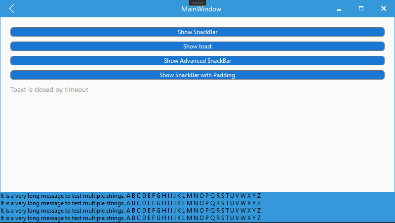
With advanced settings you can customize Message options and Toast options:
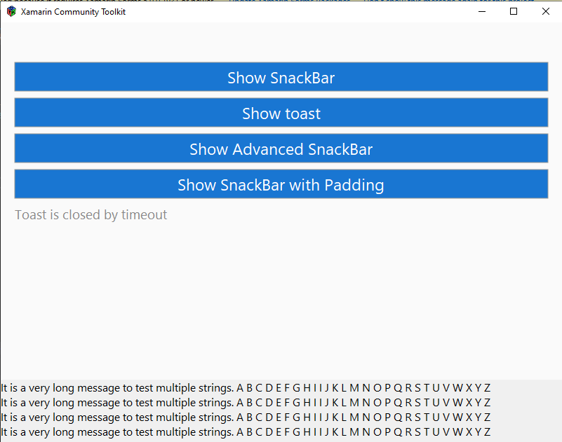
Snackbar
Snackbars inform users of a process that an app has performed or will perform. They appear temporarily, towards the bottom of the screen
Snackbar has an API that is similar to Toast.
Simple execution with predefined settings. On your Page call the method:
where message is your text, actionButtonText is the text for the button, action is a Func<Task> and duration is optional parameter. Default duration = 3000 milliseconds;
The result is Boolean. True - if Snackbar is closed by the user. False - if Snackbar is closed by timeout.
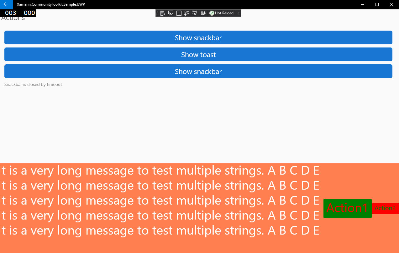
With advanced settings you have a full control for all
MessageOptions,SnackBarActionOptionsandSnackBarOptions:
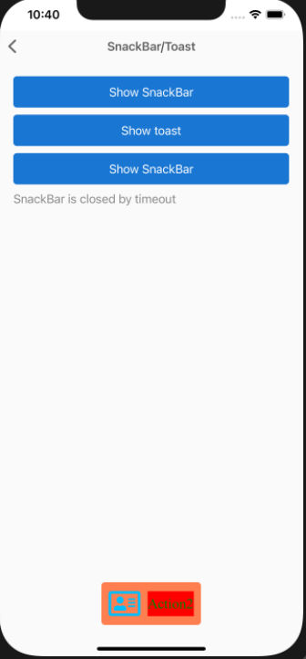
Details of implementation and limitations for different platforms
I
Both Toast and Snackbar work on all platforms: Android, iOS, macOS, UWP, WPF, GTK, and Tizen.
II
Both Toast and Snackbar by default use native colors and automatically change them depending on the system theme.
III
"Native" Toast and Snackbar is available only on Android and was created by Google.
Other platforms use "Container" (UIView for iOS, NSView for macOS, Grid for WPF, HBox for GTK, and Dialog for Tizen) to display a message and action buttons.
Because of Android limitations, it has only 1 action button, while all other platforms can display multiple action buttons.
IV
Android uses snackbar for both DisplayToastAsync and DisplaySnackbarAsync. The difference is that DisplayToastAsync hides the action button.
Nightly builds and new API
Update 1 - Set the Padding
A new property Thickness Padding { get; set; } was added to MessageOptions and SnackBarActionOptions.
Update 2 - Set the Anchor
Now you can anchor the toast and the snackbar to any VisualElement like this:
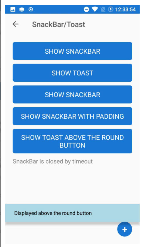
Feel free to try it and leave your feedback. Happy coding!

